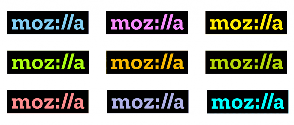
Finally, Mozilla changed its popular dinosaur logo with something minimalist which actually replaces the middle “ill” of Mozilla with “://”.
Mozilla Just Unveiled Its New Logo
After a creative process that began seven months ago, today we learned the new logo of Mozilla. Last June, the foundation announced its intention to update its brand identity, and today finally presented to us the result, you can see above.
True to its principles of open source, Mozilla has not hired an advertising agency to create its new corporate identity but has been a public and open process in which the community could participate by sending their proposals. The company says it has received thousands of designs, and among all the alternatives have chosen the one you can see in the next video.
Finally, Mozilla has opted for the simplest and minimalist option out of all that had been selected to move to the final phase. As you can see in the image that we left below, some of the proposals were truly extravagant, inappropriate and unhelpful to be able to constitute a logo and its declinations.
The version of which the foundation is left replaces the letters “illa” with the characters “: //”, a solution that has the purpose of transmitting that the Internet is the heart of Mozilla. Typography both letters and characters called Zilla, it has been created especially for the company by Typotheque and can be downloaded for free.
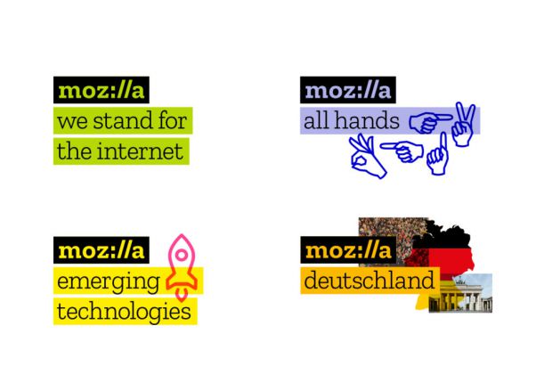
In addition, the black box is a key element of the logo design, as it represents the way in which we select the typography in the programs and tools.
As for the color palette, letters tones may vary depending on the context and the circumstances used under. The foundation assures that later they will define a range of colors, intensities, and guidelines in its guide to style. In addition, Mozilla will allow communities around the world to create their own identity by selecting color and choosing the images that they find the most representative.


