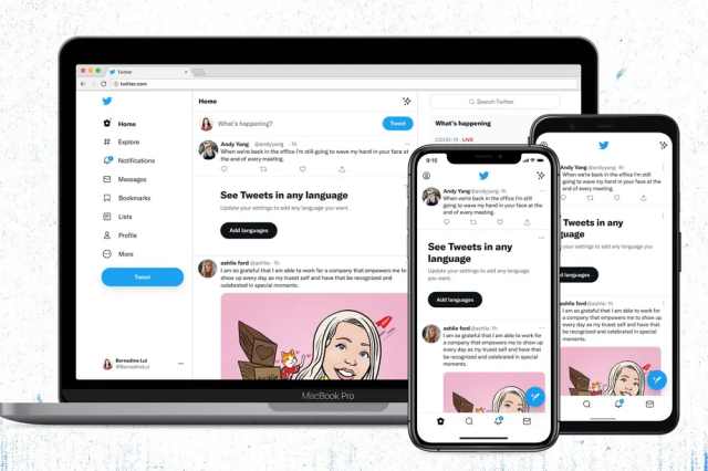
Recently, Twitter has brought few changes in the interface, like the color scheme on both desktop and mobile apps. The major highlights were the higher color contrast of buttons, links, and focus.
However, these new changes did not go well with the users, and few of them reported eye strain, headaches, and migraines due to the higher visual contrast. After getting the feedback, the micro-blogging platform has announced to change the contrast on all buttons.
Twitter Making Contrast Changes on all Buttons
In a post, the company said that they are making changes in contrast on all buttons to make it easier for the eye as many of you said the new look is uncomfortable.
The Twitter Accessibility account posted a tweet and said,
We're making contrast changes on all buttons to make them easier on the eyes because you told us the new look is uncomfortable for people with sensory sensitivities. We're listening and iterating.
— Twitter Accessibility (@TwitterA11y) August 13, 2021
This week, when Twitter announced a new design of its app with a new font, some users tweeted and said its difficult to read the posts. Twitter has brought Chirp font to the app and the feed that makes your app interface look different.
There’s a black follow button filled in if you are not following someone, this confused many people, and this has also come in changes in the contrast. However, it is not known yet that this will be changed or not.
High contrast is useful for people who have low vision or are colorblind, but it’s not good for people who are sensitive to bright colors.
The flexibility allows the users to choose the options that work for them. At present, Twitter has toggles in the accessibility menu for settings like reducing motion, increase color contrast, display settings to choose from light and dark themes.
If users had more options to select the level of contrast, then it can save a lot of headaches. Instead of waiting for Twitter to make universal changes, it’s better to have options to make changes manually.


